Last modified: 2006-07-08 by jarig bakker
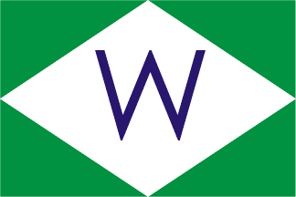
Keywords: wagenborg | walvisvaart | wim | westpolder | wijklijn | wijnne & barends |
Links: FOTW homepage |
search |
disclaimer and copyright |
write us |
mirrors
![[Wagenborg Shipping]](../images/n/nl~wagen.gif) image by Jorge Candeias, 21 March 1999
image by Jorge Candeias, 21 March 1999
Quartered per saltire in red (above and below) and white (hoist and
fly). A black chimney with two white stripes longitudinally centered and
based at the bottom.
Jorge Candeias, 21 March 1999
(Source: Company's website)
Al Fisher, 13 February 1999
 image by Jarig Bakker, 31 January 2001
Houseflag of N.V. Nederlandsche Maatschappij voor de Walvisvaart, Amsterdam.
Image from Flagchart of houseflags of Dutch shipping companies, attached
to the magazine "De Blauwe Wimpel", April 1956.
Jarig Bakker, 1 Feb 2001
Nederlandse Maatschappij voor de Walvischvaart N.V. Other sources [after
1956] show the cantons bands being equal and the letters being separated
whilst US Navy 1961 shows a very large "W" only positioned mid fly.
Neale Rosanoski, 25 Sep 2003
![[Waterweg houseflag]](../images/n/nl~ww.gif) image by Jarig Bakker, 9 Mar 2005
image by Jarig Bakker, 9 Mar 2005
Jan Mertens reported this link.
Waterweg, Den Helder - burgee horizontal BWB; in center red "W" fimbriated
white.
Rederij Waterweg bv is one of the biggest shipping companies in Europe
which is specialized in dredging support and several other tasks in coastal
waters, all over the world (e.g. Sakhalin).
Jarig Bakker, 9 Mar 2005
![[Waterweg houseflag]](../images/n/nl~wwv.gif) image by Gerard van der Vaart, 17 Apr 2005
image by Gerard van der Vaart, 17 Apr 2005
Gerard van der Vaart has been involved in a project for the preservation
of a tugboat in Maassluis (Zuid-Holland province).
He took several pictures of flagged tugs (mostly signalling flag), with
in the center houseflags of tugging companies.
Waterweg, Den Helder - Argentine-like flag with red "W" shifted towards
the hoist. Shipmate made several flags for this company, none with the
white fimbriation, as shown on FOTW. Probably the white fimbriation is
only used for tableflags.
Jarig Bakker, 17 Apr 2005
![[van der Wees]](../images/n/nl~wees.gif) image by Jarig Bakker, 1 Mar 2006
image by Jarig Bakker, 1 Mar 2006
More specifically æA. van der Wees & Co. B.V. Schroefboot & TransportondernemingÆ, Dordrecht (the last part meaning æScrew-Driven Boat & Transport CompanyÆ), this firm is featured in ōDuwvaartö by Jansen & Van Heck, pp. 109-111.
Website of
the Van der Wees group concerning water transportation, with an English
section (click Union Jack) IÆm quoting from:
ōAs a transport company founded in 1907 specializing in transport on
the inland waterways between Delft and Dordrecht in The Netherlands, we
have grown into a leading player on the European Exceptional Transport
Market.
The Roll-on Roll-off principle, widely known on English Channel ferries,
has been developed for European river and canal purposes using flattop
as well as drive-in pontoons (ģ) Our flattop pontoons are all certified
for seagoing purposes, enabling us to carry out international transport
crossing North European seas or beyond. (ģ) In addition to executing
transports of for instance transformers, turbines, harbour cranes, vessels,
columns and airplanes we have regularly assisted the installation and removal
of bridges and roro link spans.ö
Just clicking on the thumbnails in the sections æBotenÆ, æPontonsÆ
and æProjectenÆ leads you to an impressive array of various sailing and
floating vessels.
Jansen & Van Heck give a detailed company history, IÆll just add
some highlights to the above. FounderÆs name was Abraham van der
Wees. Worked for Shell starting 1917, transporting oil drums. Engaged
in passenger transport immediately after WWII as bridges, roads and railways
were damaged. Push navigation since 1961. Relocated from Delft
to Dordrecht in 1970.
The flag as shown by above authors in b/w is described as being brown
with a yellow initial W plus yellow waves and curlicues (placed beneath
the letter). As the
Van der Wees group also has an interest in road transport, we find
both means of transportation symbolized by the waves resp. the wheel shapes.
Jan Mertens, 27 Feb 2006
![[West-Indische Maildienst]](../images/n/nl~wim.gif) image by Jarig Bakker, 19 Oct 2003
image by Jarig Bakker, 19 Oct 2003
Koninklijke West-Indische Maildienst (Royal West-Indian Mailservice),
Amsterdam; founded 1882, services to the West-Indies and New York (US),
after image from Brockhaus' Konversations-Lexikon, 14th ed., c. 1907.
White with red St. Andrew's Cross; top: red Crown, in hoist, fly, and bottom
red letters W.I.M.
Jarig Bakker, 19 Oct 2003
"Sandy Hook's 1930 W.I.M. flag is small, but there are no dots after
the letters. Furthermore, the crown is yellow in this version but
that may be a mistake... or has it anything to do with the line becoming
'Royal'?
Jan Mertens, 14 Nov 2003
Griffin 1895, Lloyds 1904 and 1912 and Liverpool Journal of Commerce
1909 sheet all show red charges but Brown 1926 changes the crown to yellow.
The name renamed the same throughout. Of these only Lloyds 1904 shows dots
after the letters.
Neale Rosanoski, 7 Jan 2004
![[KWIM houseflag]](../images/n/nl~kwim.gif) image by Jarig Bakker, 17 Jan 2005
image by Jarig Bakker, 17 Jan 2005
Koninklijke West Indische Maildienst, Amsterdam (Royal West-Indian Mailservice)
- white flag, red saltire; in top yellow crown; at hoist, fly and bottom
"WIM".
Source: Brown's Flags and Funnels of British and Foreign Steamship
Companies, compiled by F.J.N. Wedge, Glasgow, 1926 [wed26].
Jarig Bakker, 17 Jan 2005
 image by Jarig Bakker, 2 February 2001
Houseflag of N.V. Stoomvaart Maatschappij "Westpolder", Rotterdam.
Image from Flagchart of houseflags of Dutch shipping companies, attached
to the magazine "De Blauwe Wimpel", April 1956. Same flag and funnel used
by Cornelders Scheepvaart Maatschappij.
Jarig Bakker, 1 Feb 2001
N.V. Stoomvaart Maatschappij "Westpolder". Sources vary with the colour
of the letter. Talbot-Booth 1942 and 1944 gives it as green for describing
the design appearing as a panel on the funnel, not showing the actual flag
but normally they would be identical. Later ABC Foreign Coastal Freighters
for the funnel panel gives a black "W" and this is supported for both panel
and actual flag by Wyt's Digest of 1960. Presumably this adds up to it
being a very dark shade, whichever the colour.
Neale Rosanoski, 25 Sep 2003
![[Wijgula houseflag]](../images/n/nl~wgl.gif) image by Eugene Ipavec, 19 Jun 2006, after image on this
site.
image by Eugene Ipavec, 19 Jun 2006, after image on this
site.
Briefly mentioned in ōDuwvaartö by Jansen & Van Heck, p. 138, Wijgula
really means Wijnhof & Van Gulpen & Larsen. First established in
Amsterdam and then 1972-1982 in Nijmegen, the company is now based at Druten.
Company website (with
English section) followed by quote from æBusiness profileÆ:
ōSince its establishment in 1922, Wijgula B.V. has become one of the
leading inland tank-barging companies specialising in the transportation
of various bulk liquid products. For our customers we manage a fleet
of 42 modern tankships varying in size and onboard equipment. Our fleet
has a total loading capacity of 49,000 mt and a tank volume of 40,000 cbm.
(ģ) Wijgula BV Druten is a subsidiary of the Imperial Reederei-Group, in
which Imperial Logistics GmbH, Duisburg, has a controlling interest.ö
The firm stresses the fact that it uses double-hull tankers.
This
page (in Dutch) contains additional information, relating among other
things the accidental meeting of a young German, Hans Larsen, with Mr Van
Gulpen who ran a chemical business in Amsterdam together with his business
partner, Mr Wijnhof. The three men founded the firm in 1922 and soon
started shipping sulphuric acid; other chemical substances were to follow.
(Although the name æWijgulaÆ recalls their names, in the beginning this
was merely the telegraph address.) In 1991 the company became
part of Haniel Reederei in Duisburg, Germany, currently Imperial Reederei.
Jansen & Van Heck show the house flag in b/w and describe it as
an orange triangular pennant with a black cylinder (perhaps a drum, jm)
bearing white initials æWGLÆ. WijgulaÆs website does not show this
pennant very clearly or prominently but the photo on this
webpage gives an idea.
Jan Mertens, 2 Mar 2006
Druten is in Gelderland province on the
river Waal, opposite the former nuclear plant of Dodewaard, which was closed
in the 1970's after huge demonstrations.
Jarig Bakker, 3 Mar 2006
![[Wijklijn houseflag]](../images/n/nl~smwl.gif) image by Jarig Bakker, 18 Oct 2003
image by Jarig Bakker, 18 Oct 2003
Stoomvaart Maatschappij "Wijklijn", Rotterdam - houseflag: white with
a Green St. Andre's Cross; the field at the hoist charged with a black
letter "E"; at the fly a black letter "D". Flown 1901-1987; ED stand for
Erhardt & Dekkers.
Source: houseflagchart attached to the magazine "De Blauwe Wimpel",
April 1956.
Jarig Bakker, 18 Oct 2003
This was only one of the companies under which Erhardt & Dekkers
registered their ships, being the most appropriate with vessel names having
the suffix ōwijkö. For some reason Dutch sources have noted the
livery under one or more of these subsidiaries rather than the owner which
would be more appropriate.
Neale Rosanoski, 7 Jan 2004
![[Van Wijngaarden houseflag]](../images/n/nl~vwij.gif) image by Jarig Bakker, 21 May 2006
image by Jarig Bakker, 21 May 2006
Van Wijngaarden Marine Services BV at Sliedrecht, on the Beneden ("lower") Merwede River, presents itself as a company operating tugs, tow/push vessels, survey boats, pontoons equipped with cranes, etc.
As the above vessels may be chartered, Van Wijngaarden helps out various dredging and construction companies around the world. The menu on the left side of the site leads to descriptions and photos, some of them rather impressive, detailing the kinds of services offered.
The company logo is an orange square bearing a blue ævWÆ monogram, the
ævÆ nestling inside the æWÆ the left arm of which ends in an arrowpoint.
Extended into a rectangle, it serves as the house flag which is seen on
the tug æIJsselstroomÆ.
I'm afraid the choice of colours is debatable.
Jan Mertens, 29 Apr 2006
...remarkably similar to the logo of Volkswagen!
James Dignan, 22 May 2006
![[Wijnne & Barends' Cargadoors- en agentuurkantoren BV]](../images/n/nl~wijnn.gif) image by Jarig Bakker, 23 Sep 2005
image by Jarig Bakker, 23 Sep 2005
Wijnne & Barends' Cargadoors- en agentuurkantoren BV. Originated
1855 as Wijnne Barends N.V. changing name at end of last century. The original
flag was white with the black letters "W&B" which was changed to the
version shown 4/1968. Brown 1978 shows a red version which I would normally
regard as a printing error but the Josef
Nüsse's site also shows this coloured flag making its actual existence
possible.
Neale Rosanoski, 25 Sep 2003
Image after Brown's Flags and Funnels Shipping Companies of the World,
compiled by J.L. Loughran, Glasgow, 1995 [lgr95].
Wijnne & Barends B.V., Delfzijl - triband of white and orange;
on orange two narrow bent white lines; at hoist white "W", at fly white
"B". The company website shows
its logo without top and bottom white stripe, while it has topleft a waving
flag with red instead of orange, and clearly visible white bottom and top
stripes.
Jarig Bakker, 23 Sep 2005
![[Bureau Wijsmuller new flag]](../images/n/nl~wijsm.gif) image by Jarig Bakker, 6 Jan 2006
image by Jarig Bakker, 6 Jan 2006
Image after Brown's Flags and Funnels Shipping Companies of the World,
compiled by J.L. Loughran, Glasgow, 1995 [lgr95]
Wijsmuller B.V., IJmuiden - blue flag, white disk, black "W".
Jarig Bakker, 6 Jan 2006
![[Wijsmuller houseflag]](../images/n/nl~bw.gif) image by Jarig Bakker, 22 Oct 2003
image by Jarig Bakker, 22 Oct 2003
N.V. Bureau Wijsmuller, IJmuiden (a towing company).
Houseflag: three horizontal stripes red - white - blue; in the center
an elongated white hexagon charged with B.W. in black
Image from Flagchart of houseflags of Dutch shipping companies, attached
to the magazine "De Blauwe Wimpel", April 1956.
Jarig Bakker, 22 Oct 2003