 ,
i.e., used in military ships hoisted in the rear mast.
,
i.e., used in military ships hoisted in the rear mast.António Martins, 21 Sep 1997

Last modified: 2006-09-30 by antónio martins
Keywords: kingdom of portugal | reino de portugal | royal standard | coat of arms (bordure) | naval jack | pennant | crown | pedro 5 (portugal) | peter 5 (portugal) | pvr | cross: christ knights (latin) |
Links: FOTW homepage |
search |
disclaimer and copyright |
write us |
mirrors
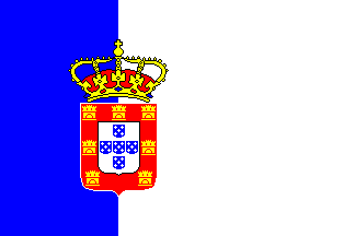
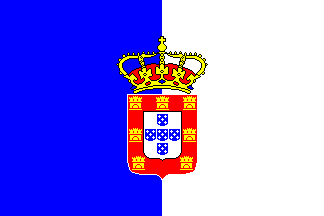
Where both these flags used, was the flag altered around the turn
of the century, or again, is one incorrect?
James Dignan, 26 Sep 1996
I think that one is a flag and the other is an ensign (I read this)
but I have seen an image of the Portuguese ensign that is red with the
shield.
Jaume Ollé
My 19th century flag charts show it both ways. The majority show the vertical division in the center, but the ones that I have more faith in show it offset towards the hoist. There is no discernable difference according to dates: from the 1850’s to the 1910’s, there is this confusion.
I have two actual examples of Portugese flags of this period. The small, cheaply printed cotton stick flag has the division in the center, whilst the large sewn flag has it offset towards the hoist.
I happen to have a duplicate copy of Preble’s 1872 book [pre72] here in my office. In the text Preble says that «The ensign is half pale blue and white, vertical and similarly charged, the blue next to the staff.» This implies the blue and white are equal. But the illustration shows the vertical division and arms offset towards the hoist! Here in a single, reputable publication, you have both versions given. I suspect that the version with the arms offset towards the hoist is correct: the centered version is probably just a poor interpretation of the design.
Nick Artimovich, 26 Sep 1996
The old flag of the kingdom of Portugal was blue and white with a
shield and equal vertical stripes for use on land (1830-1911), and unequal
stripes (the blue 1/3, the white 2/3) for use at sea (1830-1911).
Jaume Ollé, 1995
The flag of the Kingdom of Portugal (Reino de Portugal),
adopted in 1830 and replaced in 1910 by the present one had proportions
2:3, vertically divided blue on the hoist (1:3) and white (2:3) on the
fly. The royal coat of arms was like the later one
but with no armillary sphere and with a crown above it. The bottom of the
shield, however, is not round like the republican flag and in
pre-1820 flags but like a horizontal "{"
(samnitic, a.k.a. french, shield).
António Martins, 07 Nov 1996
According to a 1908 book [coe08] with a lot of info about portuguese flags, two decretes of 18 October 1830 (issued by the Liberal Government of Dom Pedro exiled in Terceira Island, Azores — Junta Governativa da Ilha Terceira) prescribes the national flag diferently: The Navy Department (Repartição da Marinha) says the blue field should be 1/3, and the Army Department (Repartição da Guerra) says it should be 1/2.
This is explained by this book’s author, Trindade Coelho, by that the flags hoisted abord ships wear off a lot in the fly part, while regimental and other army flags are square and seldom free flying. He adds that «The national portuguese flag, as used aboard war and merchant ships, and also in fortresses and State buildings, is 1/3 blue and 1/2 white.» After this I don’t know very well how to classify the usage of these flags any more…
Blue and white, based on the doubtful coat of arms of (the first) King Afonso Henriques, were the colors of the national cockade (laço nacional) since 21 August 1821.
António Martins, 21 Sep 1997
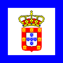
The 1830 naval jack of Portugal was a white square bordered blue
(1/8) with the national coat of arms in the center. It’s usage,
I suppose, was  ,
i.e., used in military ships hoisted in the rear mast.
António Martins, 21 Sep 1997
In portuguese legal texts "jack nacional" or "jaco
nacional", a strange usage of the english word, showing the british
influence on Portugal by that time.
António Martins, 21 Sep 1997
Based on the ANC
page and Jane’s Fighting Ships 1906
[jfs], this was the Naval Pennant.
Miles Li, 27 Jan 2006
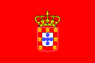
The book [coe08] mentions bunch of
royal standards from the 17th and 18th cent. They followed the same pattern,
with the national (royal) arms in the center
of a plain color background. These varied a bit throughout the time
and apparently went fixed in bright red by King João V (1705-1750).
Still according to [coe08], Queen Maria II
(1826-1828 and 1833-1853) used also a red standard. (The book gives no info
about the other Kings.)
António Martins, 07 Apr 1999
Based on the ANC
page and Jane’s Fighting Ships 1906
[jfs], this was also used as a rank flag in
Portuguese Navy ships.
Miles Li, 22 Jan 2006
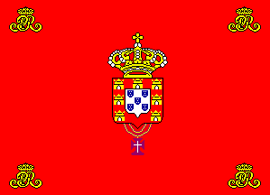
In a former royal palace, now a Museum, in Sintra, near Lisbon, it is displayed (even shows in a printed catalogue) a large tapestry carpet with the royal standard of Pedro V (1853-1861), said to be a contemporary item. The good news are it is also red, confirming the tendence. It bears the royal cypher ("PvR") in each corner, an interesting distinguishing device. I wander if other royal standards had them too.
Unfortunately, the coat of arms itself present a number of grosse heraldry errors, showing towers instead of castles and the eschuteons in saltire instead of in cross. These are errors considering the traditional aspect of the portuguese coat of arms, already completely established since long when this carpet was ever made. What I dont know is wheather all flags and arms in this time were all like this (incorrect and ugly), or if it was a once off poor heraldry attempt…
António Martins, 07 Apr 1999
Anything below this line was not added by the editor of this page.