

Last modified: 2006-02-25 by antonio martins
Keywords: error | ratio: 9:13 | tower (yellow) | castle (yellow) | armillary sphere | wheel (yellow) |
Links: FOTW homepage |
search |
disclaimer and copyright |
write us |
mirrors
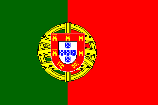
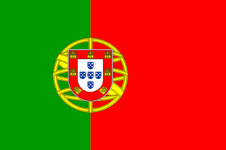
The official design that ever existed is the one still in
use, with two parts of green on the hoist and three parts on the fly, and
always with the coat of arms (centered on the partition line, half the
flag’s height in diameter). Given the relatively complexity of these specs,
however, simplifications and incorrect versions abound,
though.
António Martins, 02 Jan 2002
At Euro celebrations shown on TV, I seen Portugal flags as they are,
minus the coat of arms.
Zach Harden, 02 Jan 2002
I saw this seal-less flag flying in several places in France too,
intending to be displayed for Portugal (because it was flying with 14 other
flags which were similar to the 14 other UE
members’ flags).
Olivier Touzeau, 25 Feb 2003
I have also seen pieces of green and red cloth in a line with other
E.U. member states’ flags, and I have seen them in Spain and in France.
These are not bunting. They are pieces of cloth in the
shape of a flag and flown from staffs or strung in a line with other flags
which they resemble in shape and size. They are flags.
They incorrectly symbolise Portugal, of course, but they are flown
(ignorantly) specifically to symbolise Portugal.
André Coutanche, 26 Feb 2003
The flag of green and red vertically divided off-centered to hoist
has no meaning whatsoever per se. It is a flag, certainly, if it is
made of cloth and hoisted from a flag pole (it would be a flag even
if that’s done virtaully, say per animated-gif, or even just as
rectangular “patch” found on a begining of PT language
paragraph on candy bar wrappings), but it is not the flag. I.e.
it is not the flag of Portugal.
Željko Heimer, 26 Feb 2003
My experience tells me that that ugly rag is only used outside
Portugal, probably to spare money with cheap displays, or something of the
sort…
Jorge Candeias, 26 Feb 2003
They are certainly not according to the portuguese flag legal
specification, which specifically specifies the coat of arms, though
armless versions of the flag is an often seen simplifications —
not really as a flag, but as a representation of the flag in iconic
displays, as acceptable and proper as, f.i., an US
flag with fewer stripes and stripes would be. Moreover, that design
is used (with some sort or law backing it, I reckon) as
tail fin and fuselage marking in some
portuguese registered aircraft — namely warplanes and airliners.
António Martins, 05 Jan 2002
Our company sells this flag, made by Annin. Until some company decides
to produce the flag with the arms, this is the only
“courtesy” flag that we can offer. For some, being able to show their colors
in part is better than not at all.
Rick Wyatt, 25 Feb 2003
The plain, armless, variation is one the more acceptable “mistakes”.
Perhaps all portuguese heraldists and vexillologists would admit that such
a simplification (or with a yellow disc in lieu of the
arms) is much more acceptable than grossly misdepicted arms, as f.i. in the
Corel Draw suite clipart.
António Martins, 26 Aug 2003
A friend on mine, in Macao, reported seeing them in use on small
craft, without the arms.
Jim Ferrigan, 26 Feb 2003
I can understand how poor fishermen preferred to sew together two pieces
of red and green cloth to be marginally within the law that orders vessels
to display the flag of the nation they are registered in, instead of spending
much-needed money in the purchase of fully armed flags. I can also see the
portuguese authorities closing their eyes to that violation, even in the
times of dictatorship.
Jorge Candeias, 27 Feb 2003
by António Martins, 23 Aug 2003
The french city of Evian-les-Bains (where
the last G8 summit took place) is decorated with vertical flags of several
nations. The Portuguese flag is indeed without the emblem in the middle.
I could not check the exact proportions of the flag, which was
rectangular (not forked), with at least the red field bigger than
the green one.
(I am surprised nobody complained about this flag, since there is a
sizeable Portuguese community in Evian and the neigborhood.)
Ivan Sache, 23 Aug 2003
Correct red-to-green ratio must go along correct (or at least approximate)
height-to-width ratio. Vertical portuguese national “flags” with
unequal stripes, with coat of arms or not, are percieved as just plain
odd.
António Martins, 26 Aug 2003

I have a plate that I believe dates from between 1912 and 1917. It
depicts the flags of several countries, including Portugal. The flag
for Portugal, though, seems to be incorrect: It is shown as a red and
green flag, split 50/50, with no sphere or shield.
Steve DeGroof, 29 Dec 2001
Occasionally had-made flags are produced and flown or (more commonly)
waved without the arms, and they look plain (pun intended) awful.
Jorge Candeias, 24 Feb 2004
Simplifications and incorrect versions abound.
A simple red/green vertical equal bicolor is perhaps the most simple as
it gets.
António Martins, 02 Jan 2002
This is especially so when vertical
flags are envolved.
António Martins, 26 Aug 2003
It is also widely used as a simplication of the portuguese national
flag, especially for sash and ribbon design. See f.i. the flag inspired
TAP logo and airliner livery.
António Martins, 24 Feb 2004
The quite usual wrong variation of the portuguese flag (and coat of
arms), with towers instead of castles.
António Martins, 13 Dec 2001
This flag (officially lowered
for the last time at the private residence of the last portuguese
governor of Macao) is wrong!! It has towers
instead of castles! (That is a quite usual mistake, by the way.) Some
joke of an empire, I say: they dont even care to have properly depicted
flags!
António Martins, 23 Dec 1999
However I was shocked to learn that flag manufacturers make the
national flag in 90×130 cm dimentions (ratio 9:13), instead of the
correct 90×135 cm (ratio 2:3): I was told by one of them that it is
so because 130 is a “more even” number than 135!… At any
rate, however, larger flags follow the official proportions: seems that
f.i. the figures 2×3 m are “even” enough…
However, since 90 cm high are the most often used flags, one can say
that there are more wrong flags in use than correct ones.
António Martins, 13 Jul 1999
Another typical mistake, “flipped arms”: I saw it again, hoisted
on 2003.04 at the balcony of the São Brás de Alportel
municipal HQ.
António Martins, 24 Feb 2004
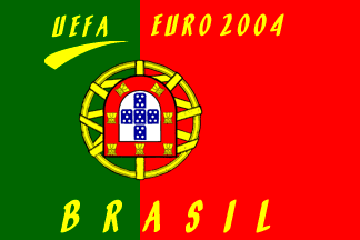
This has got to be the ugliest flag I’ve ever seen… As has
already been reported, Portugal is currently
experiencing an unprecedented flag craze… And not all of the flags are
entirely correct. I’ve seen
this flag flying from a window here in Lisbon. It consists of the
national flag flipped vertically
with yellow “comic book” lettering applied over it: in the top
"UEFA Euro 2004", and in the bottom, most peculiar of all, "Brasil"!
The flag is clearly not home-made, it has clearly been printed in industrial
machines. I’ve seen at least another of these flags, but this one had a
somewhat more reasonable lettering in the bottom : "Portugal".
João Madureira, 19 Jun 2004
The average portuguese flag… lacking the armillary sphere… I found
this in a restaurant in Barcelona, serving brazilian and portuguese cuisine.
It could be a monarchist flag,
using though the republican colors and lacking
the crown — but it would be the only one I ever saw. I bet for sheer
ignorance and carelessness.
António Martins, 18 Jul 1999 and 07 Nov 2001
Even such an extremely precise and valuable reference as Der Gross
Flaggenbuch [neu92] of the German
Kriegsmarine painted it in light green (alongside the tones of dark green
for other flags; therefore it was not a printing default), so this is
nothing new.
Obviously cheap thin cloth will never look very dark, and
I guess this is one of the reasons why the light green is more
comfortable.
This is obviously what
Columbano Bordalo Pinheiro, the artist who
presided the flag comission, had in mind.
The word “dark” was used because he wanted it
there, not by chance. He didn’t want a flag that would look lighter on
the hoist side.
A. S. Marques, 25 Nov 1998
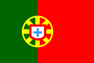
I got this from a toy packaging with multi-language instructions: the portuguese national flag in a fair enough arragement of both main panels (approx. 2+3 instead of the frequent mistakes 1+1 or 1+2), but quite amiss about the central emblem:
In place of the armilary sphere a wheel like contraption, with a circular rim and eight rays converging to the center; on it a shield, indeed white and bordered red but without the castles and with the 1+2+1 escutcheons replaced by a single couped cross.
This is an acceptable simplification, perhaps even satisfactory for the non-portuguese and the non-vexillologist/heraldist. But the same packaging had also a spanish national flag with a lot more of accurate detail (the only obvious mistake being in the Leon quarter).
This means that whover could find clipart a decent spanish national flag could not found for a portuguese one — the Portuguese Government made a mistake in 1911 by accepting for the new national flag such an overtly complex design (and, unlike the spanish case, unsimplifiable), by never supporting and publicizing clear specifications, they have been worseing that mistake ever since.
António Martins, 20 Oct 2003