
Last modified: 2006-09-30 by antónio martins
Keywords: feira nova | flagoid | fractal | docapesca — portos e lotas | s. a. | dp | fish | associação de lisbonense proprietários | alp | disc (blue) | helvetica | squares: 5 | cross: squares | rinave |
Links: FOTW homepage |
search |
disclaimer and copyright |
write us |
mirrors
Docapesca is a state-owned company that manages fishing port facilities and first sale fish markets all over Portugal. They have local headquarters in all the major ports and, in the Lisbon area, they have headquarters in a very valuable terrain by the sea in the Cascais bay. When the current government decided to put forward a candidacy to the organization of the America’s Cup (a sort of world cup in sailing, for those who do not know), it decided to close those facilities and promote on that place a luxury urbanization. The workers fought against the measure, fearing unemployment, and saying that the America’s Cup was nothing but a pretext to kick them in the butt. Since Lisbon already lost for Valencia the organization of the Cup and the government already said that the plan to close Docapesca is to go ahead, they seem to be right.
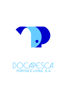
Anyway, they struggled (and will probably go on struggling) and in a news report of that struggle there was a flag. Odds are that this isn’t the official flag of the company — in Portugal official flags are never vertical, as far as I know —, but can be pretty close. It’s a white vertical flag with the Docapesca logo in the center. I used the proportions 3:2, but this, of course, is not certain. About the colours, I remember that the flag had very light shades of blue, with very low contrast with the white field. But if you go to the site of Docapesca, the shades are a lot darker.
Jorge Candeias, 01 Dec 2003
The logo shows a stylized leaping fish, making up the initials
"DP".
António Martins, 02 Aug 2004
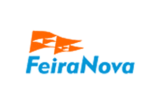
Feira Nova (new fair), portuguese supermarket chain;
the company flag is simply the logo on a white rectangular flag.
António Martins, 07 Nov 2003
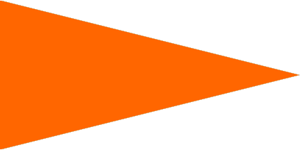
The logo is intersting in that it consists of a
stylized view of many flags flying, these being orange triangular pennants.
A single orange triangle is used ad nauseam in Feira
Nova’s advertising material, as price tag marker, leaflet ornament
etc.
António Martins, 07 Nov 2003
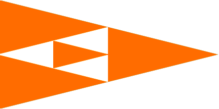
Another interpretation of the logo could be of two
triangular pennants flying with the nearmost obscuring the farthest, both
orange with a large white triangle throughout and pointing to the hoist, itself
charged with a smaller orange triangle pointing to the fly, in fractal
fashion.
António Martins, 07 Nov 2003
Other sites:

A while ago, my usual newspaper published during some time a full-page ad
to one insurance company called Real Seguros. The ad was basically the
photo of three smiling professionals standing in front of the company
headquarters, where the flag of Real Seguros company is very visible:
a light flag with a logo in the center. The ad also mentioned the
company’s website. I guess that
"light" here means in fact "white" — these flags are almost always white,
unfortunately. As for the logo, it’s a blue stylized ribbon, draped in a
90° angle, hanging over a green ball, with the company’s
name in grey capitals, to its right.
Jorge Candeias, 07 Mar 2005

Rinave (company website) is a small corporate group that owns several companies of services (consulting, navigation agents, certification, etc.). In an ad of one of the companies, Rinave Certificação e Auditoria in Público newspaper of July 2003, are shown the headquarters of the group, in Lisbon, and 4 flags:
 image by António Martins, 22 May 2005 | |
Helveticawear’s logo is a variation of the Swiss confederation cross, made from five squares with slightly rounded corners, placed 1+3+1 (I wonder if the topological similarity with the portuguese arms is coincidental…).
In the previous version of the site, a photo showing the flag “on location” was shown; this photo is also used as wall decoration in the stores. It depicts a suitable Swiss landscape with a flag pole (it seems digitally added) sporting a flag. This is ~1:2 red with a white bottom stripe with red lettering "HELVETICA" in wide sans letters and the logo in white at the hoist. (Not a bad design, all considered.)
The photo shows the hoist at the observer’s right hand side, yet the lettering is readable — either the flag is “two-sided” or the obverse of this flag has indeed its hoist at the observer’s right hand side.
A casual browse thru HelveticaWear.COM does not reveal at once that this clothes store brand has little or nothing to do with Switzerland. It is actually a portuguese brand, lauched in 2004 and planned to grow into the spanish market in the mid term; meanwhile "Helvetica (R)" have as much as three stores in trendy portuguese malls. (Their recently refurbished website claims “partnership” with Swiss International Air Lines but provides no hyperlink to it; it also claims a “connection” with Porsche, but they call it "Porche" (and they also say "perfomance") and provide no hyperlink to it… The tagline "swiss eng." below the logo, though smart marketing, is probably illegal.)
António Martins, 22 May 2005
I’d bet high that the reverse of this flag
would be like this.
If only it didn’t include the lettering, it would
be a great flag!…
Jorge Candeias, 23 May 2005

A while ago, one of the supplements to the Público newspaper
included a full page ad to a portuguese pharmaceutical company specializing in
ophtalmology, dermatology and dermocosmetics, called EDOL (see
company website). The ad shows the company
headquarters and, quite proeminently, three flags: the flag of the EDOL and
two certification flags.
The EDOL flag is a very boring logo-on-bedsheet flag: white with the company
logo in the center, which consists of the company sigla in dark blue lowercase
letters with light blue horizontal bars with rounded corners above and
below.
Jorge Candeias, 17 Apr 2005

The Lisbon Home-owners Association / Associação de Lisbonense
Proprietários deals with rental tenants on behalf of the home owners.
They have a white flag with their logo on it — a white
"ALP" art deco monogram on a blue disc (which
appears as a standing ellipse). They use the flag proeminently at their HQ in
Lisbon (Príncipe Real sq.).
António Martins, 17 Sep 2003

This is a corporate flag, found in one of the supplements
Público newspaper publishes from time to time. This time it was
Distrito de Leiria (= Leiria District),
published in August 2002. The company is called Road Paint (yup, in english)
and belongs to a Grupo Lena, producing thermoplastic ink to paint roads
and streets. The flag has a tiny little original element in its square shape,
although I strongly suspect that the flag flying not from an industrial
facility but from the company headquarters will be a typical white rectangle.
The rest is as dull as a flag can get: a logo, in this case blue, on a white
sheet. The logo is a stylized road and has the company name below.
Jorge Candeias, 21 Apr 2005
Anything below this line was not added by the editor of this page.