 (2:3)
(2:3)by Pascal Gross, 27 May 2004

Last modified: 2004-08-07 by dov gutterman
Keywords: trujillo | motatan |
Links: FOTW homepage |
search |
disclaimer and copyright |
write us |
mirrors
 (2:3)
(2:3)
by Pascal Gross, 27 May 2004
See also:
The flag and Coat of Arms of Motatán are
at <www.motatan.com.ve>.
Pablo Acosta Rios, 26 September 2002
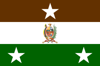
The Flag - Attributes and Semiology: Consists in a field with
approximated ratio 2:3; this is, square and half of length
divided horizontally in three stripes with equal size: brown
(superior), white (center) and green (inferior) Completes the
design the Coat of Arms of the Municipality on the center of the
white stripe and three five-pointed and white stars: one on the
center of the brown stripe and two on the green stripe.
The brown stripe symbolizes:
a. The majestic "El Conquistado" (something like
"The Conquered") Hill and the depression of the grounds
of the locality which form a great valley: geographic
characteristic by which is known the town next to the
Motatán river basins.
b. The ancient roots, beliefs and legend of Timotocuica ethnic
group: Indians with cinnamon skin, first inhabitants of the
Municipality.
c. The culture represented by the wood and the leather resounding
on the Drums of the San Benito (Saint Benedict) cult.
d. The fertility and wealth of locality grounds where not only
occur great harvests but also exist natural resources of high
importance like the thermal waters, diverse minerals and
reserves, as much of petroleum as of natural gas.
The white stripe represents:
a. The purity of the Immaculate Conception, Matron of the
Municipality and the devotion for Saint Benedict of Palermo,
symbol of faith and peace.
b. The progress and the transformation that has obtained the
Municipality in the last years.
c. The signature of its Act of Foundation on 1801 and its
elevation to Autonomous Municipality on 1989.
d. The constance and the effort of the Motatanensian for
construct a better future every day.
The green stripe symbolizes:
a. The Agriculture, the extensive channels to the Motatán river
creek and the pinneaple camp bet in the El Conquistado Hill which
join to other headings give faith of a town with great
agricultural potential.
b. The re-born of the town and the hope of its people.
The Municipal Coat of Arms alludes to to the identity and
greatness of the locality. The stars remembers the three Parishes
which integrate the Municipality and its continuous progress.
Historical Synthesis: In occasion of the Bicentennial of
Motatán, its Municipal Council organized on year 2001 a contest
destined to create the Municipal Symbols, where was winning the
Project of Flag presented by Angel Catherine Uzcátegui Rondón.
Coat of Arms: Consist in an oval field filled
in Or and divided per fess, the chief per pale. The Dexter
Quarter of the Chief enameled in Or (yellow) shows a landscape
integrated by a terrace on which runs a river crossed by a
bridge, everything in its colors. The Sinister Quarter of the
Chief, enameled in Azure (blue) presents another landscape in
which appears a current of water origined from a mountain with a
valley on its feet where rises a city, everything in its colors.
The Quarter of the Base enameled in Gules (red) shows a radiating
image of Saint Benedict flowing from an industrial center
accompanied at the dexter by three drums, everything in its
colors. Complements the designt a diminished fess in Gules (red)
that loads the inscription "MUNICIPIO MOTATÁN" in
golden capital gothic letters. As external ornaments, the blazon
presents a five-pointed star in Or as crest and as supports a
pennant striped in Or (yellow), Azure (blue) and Gules (red) to
the dexter that contains the ephemeris "2 DE SEPTIEMBRE DE
1801 (September 2nd, 1801) in golden Old English
letters enrolled on the strip in Azure (blue) and in whose
base appears a pinneaple whilst at the sinister appears a sugar
cane stem in its color, all jointed under the base by means of a
pennant in Gules (red) that shows as mottoes the following
inscriptions in Old English letters: . "EDO.TRUJILLO"
in Or at the center; "STIMAT-USTATE-AN" in Sable
(black) to the dexter and "SOY LA PUERTA DE LOS
TIMOTES" (something like "I'm the door of the Timotes'
Land") in Sable (black) to the sinister.
Semiology: On the First Quarter appears Motatán river in a dusk
running on the fertile ground of the locality, crossed by the
bridge that has gotten to constitute modern and already classic
symbol of the entrance of the Municipality. On the Second Quarter
is represented a dawn where rebounds the so called
"El Conquistado" (Something like "The
Conquered") Hill: natural ridge which limits the territories
of the Municipality where are originated the thermal springs of
"El Bańo" ("The Bath") that with their
sulfurated waters cover the local topography satiating the thirst
of their inhabitants and those of another regions of Venezuela;
on the one hand and by the other, appears the fertile Motatán
valley where raises the Capital City of the Municipality,
represented by its Modern boulevard. The Third Quarter remembers
three landmarks of the Municipal culture: the figure of "San
Benito" (Saint Benedict), symbol of the Christian faith and
heap of the Motatanensian people; the facade of the Motatán
Sugar Central, icon par excellence of the mighty and industrial
development of the locality, and the three emblematic drums of
the so called "Chimbanguele de San Benito", ancient
cultural expression of the town and that forms part of its
tradition. The denomination of the Municipality on the diminished
fess rebounds its identity and values. The star symbolizes the
locality: its people, its culture and its fight for the
permanence and development of the Motatanensian gentilitious on
the Trujillian geography. The tricolor pennant alludes to the
deep Venezuelanity of the Municipality and the ephemeris alludes
to itsr elevation to the category of ecclesiastical Parish. The
pinneaple and sugar cane remembers the fertility and the
diversity of the agricultural products that produces the
locality. The pennant in Gules emphasizes the sense of property
to Trujillo State and the phrase that is read
"stmoustateán" in cuicas native language joint with
its equivalence to Spanish reminds the origin of the name which
honored the Municipality.
Historical Synthesis: Created on 1990 by Mr. Luís Bencomo, was
redesigned by Arq. Eduardo Zambrano as a result of a contest
organized by the Municipal Council on 2001 destined to create the
Municipal Symbols in occasion of the Bicentennial of
Motatán.
Sources: Web Site Motatán.com <www.motatan.com.ve>.
Raul Orta, 26 May 2004
t-mo.jpg)
from <www.motatan.com.ve>,
located by Pablo Acosta Rios, 26 September 2002