Last modified: 2006-02-05 by antonio martins
Keywords: portimão | coat of arms | fish: tuna | head: moor | head: king | tower (white) | waves: 3 | é verão! é portimão! | sun: 8 rays | crescent: points to upper hoist | music note | sardine | fork | knife | vo |
Links: FOTW homepage |
search |
disclaimer and copyright |
write us |
mirrors

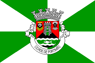
It is a quite typical portuguese municipal flag, with the coat of arms
centered on a background gyronny (meaning city
rank) of green and white. The coat of arms is gules, on a mound sable
charged with a wavy fess vert fimbriated argent bearing a tuna fish argent
lined sable, a tower argent open vert and masoned sable, between two king’s
heads proper, dexter christian, sinister moorish. Mural crown argent with
five visible towers (city rank) and white
scroll reading in black upper case letters "CIDADE DE
PORTIMÃO".
António Martins, 12 Aug 1999
Portimão municipality had 39 440 inhabitants in 1990,
and it is divided in 3 communes, covering 179 km2.
It belongs to the Faro District and
to the old province of Algarve.
António Martins, 12 Aug 1999
It is one of the main touristic cities in the main touristic region in
Portugal, the Algarve. The kind of tourism that the
area received every year is mostly composed of people looking for good
weather, heat, sunshine, good beaches and warm sea water. All of this
spells "summer" in big, bold letters, and indeed the city fills up during
the Summer, especially in August.
Jorge Candeias, 13 Sep 2003
Last year, the municipal authorities decided to do some marketing over the
city’s summer attractions, and part of this marketing consisted
in designing a few logos to be used in all documentation, tourist information,
etc. with relation with those summer activities… and in flags.
This year, the same logos and flags resurfaced, which means that this is
something that will go on at least for a few years, making it of interest
to us. All flags are hoisted as usual horizontal flags, but are taller than
wide, i.e., they are vertical. There are five of them. Each appears
on flags, identical in format to the global one,
that are displayed in the areas where such activities take place, together
with the global one. All of this makes a quite colourful display, with 5
different flags in some places, each in its own colour with its own logo. It
is also interesting to note that only the sardine refers to the
municipal symbols, where it is hardly visible between the
waves at the bottom of the coat of arms. Likely, that
happens only by accident: that sardine must refer much more to the Sardine
Festival that takes place in late July, early August, than to the municipal
symbols.
Jorge Candeias, 13 Sep 2003

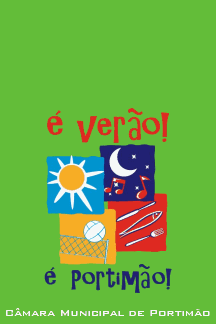
The main flag is green, with the composite logo of the campaign in the lower part and, at the bottom, the words "Câmara Municipal de Portimão" (Portimão Municipal Government), in white smallcaps. The logo consists of the campaign slogan: "é verão! é portimão!" ("it’s sumertime! it’s Portimão!" — in portuguese it rhimes) and an arrangement of the 4 partial logos. These partial logos were developped for each of the 4 areas with activities: