 Shipmate Flagchart : http://www.shipmate.nl/flags.htm
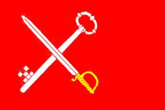
adopted 19 april 1982.

Last modified: 2003-09-06 by jarig bakker
Keywords: loppersum |
Links: FOTW homepage |
search |
disclaimer and copyright |
write us |
mirrors
 Shipmate Flagchart : http://www.shipmate.nl/flags.htm
adopted 19 april 1982.
![[Leermens village flag]](../images/n/nl-gr_lm.gif) by Jarig Bakker, 7 Jun 2003
by Jarig Bakker, 7 Jun 2003
Leermens is a village in the municipality of Loppersum, Groningen province.
It used to be in the former municipality of 't Zand Every year all
six villages of 't Zand meet for a village-contest. In 1985 it was the
turn of Leermens to organize the competition. For that event it wanted
to have its own villageflag. The society for village interests (Dorpsbelangen)
organized a contest, and asked Mr. J.A. de Doo to pick a winner. However
it appeared that some minor matters had been overlooked, such as the question:
"What is a flag?" It was decided to start a new competition, aided by this
definition:
"A flag is colorful, waving piece of cloth, which can be hoisted on
a mast, or can be carried around on a stick, which is a recognizable sign
and a coherent element for a group of people".
The flag has to be simple in design, so anyone with a sewing machine
can make it; and it should be different from other flags in order to be
recognizable. No words.
Before the deciding meeting "Dorpsbelangen" received the following
questions:
- Which are the colors which characterize the village?
- Which are the specific characteristics of the village?
Leermens is a typical Gronings terp-village with a Romano-Gothic church,
devoted to St. Donatius or Doonaart. There is no "borg" (old fortified
stately house) to which it owed allegiance. In ancient times law was administered
here. Around the village is the old "osseweg" (ox-road), and the
small canal, named "Maar", which is untouched. In the Gronings vernacular
"om Leerse koomm" means: to know what there is to know.
The colors blue for the skye, and green for the fields were chosen.
As a dividing line a red stripe was preferred (for the terp, the brickhouses).
Several geometrical forms could represent the terp (mound); other geometric
patterns were offered by the letter "L'. The attributes of St. Donatius
(an axe, a lightning, or a wheel with a sword) offered other alternatives.
Etcetera.
First some simple tricolors were tested. It was found out, that stripes
with unequal width were preferred. At the end stripes proportioned 3:1:2
were chosen.
The village silhouette dropped out of the options, because that was
too complicated.
Next experiments were carried out with the letter "L", with a flash
of lightning, and with a combination of both.
Finally two trapeziums were found, connected in such a way that they
formed a regular octogon, which represented the village-plan, and other
elements, mentioned above.
The red stripe was found too somber, and this color was replaced by
bright yellow, the color of flowering coalseedfields and ripe corn.
The final product became: three horizontal stripes of blue, yellow,
and green, proportioned 3:1:2; the middle stripe widened to a regular octagon,
with sides equal to the width of the stripe, the octagon placed at a distance
of the width of the yellow stripe from the hoist.
Source: article in Vexilla Nostra 138-139, 1985, by Mr. J.A. de
Doo.
Jarig Bakker, 30 Aug 2003
![[Stedum village flag]](../images/n/nl-gr_sd.gif) by Jarig Bakker, 7 Jun 2003
by Jarig Bakker, 7 Jun 2003
Stedum is a village and former municipality in Loppersum municipality
in Groningen province. Its flag is described in Derkwillem Visser's "Gemeentevlaggen
en wapens Koninkrijk der Nederlanden, 2001":
"5 equally wide horizontal stripes of red, white, green, white, and
blue, with in the canton the municipal arms. The knight has both feet on
the green stripe.
Adoption date: unknown."
The double eagle is the emblem of the Nittersum family. The knight
could be Eppo van Nittersum, but it is more probable, that it refers to
the Bible, 1 Thessalonicenses 5:8 "but let us, who ought to be sober by
daylight, be armed with the armour of belief and love and with the helmet
of hope and salvation". That would be the arms of Johan Clant, lord of
Stedum, who was the first to use it.
Jarig Bakker, 7 Jun 2003
![['t Zandt village flag]](../images/n/nl-gr_zt.gif) by Jarig Bakker, 7 Jun 2003
by Jarig Bakker, 7 Jun 2003
This is a former municipality and village in Loppersum municipality
in Groningen province. At this
webpage is the
"Zandstervlag".
Explanation:
The blue color has been chosen arbitrarily.
In the CoA of the former municipality 't Zandt 5 6-pointed stars symbolized
the villages belonging to it. A yellow 5-pointed star symbolizes now the
village 't Zandt.
The green clover-leaf was also used in the old arms and symbolizes
agriculture.
The 4-leaved clover (klavertjevier) also symbolizes luck.
The brown walking-stick symbolizes the nickname the Zandsters received
in olden days.
When the inhabitants of 't Zandt via Spijkster Oudendijk walked into
the direction of the muddy flats they used walking-sticks for support.
In Godlinze one could see those people and it was said then:
"There they go, the Zandster hand-sticks".
('t Zandt had two nicknames: handstokken, and moordenaars
(unfortunately it's unknown who was murdered by whom).
Jarig Bakker, 7 Jun 2003
![[Zijldijk village flag]](../images/n/nl-gr_zd.gif) Shipmate Flagchart : http://www.shipmate.nl/flags.htm
Shipmate Flagchart : http://www.shipmate.nl/flags.htm
This village is in the former municipality 't Zand, now Loppersum, high
up north in the province of Groningen, and the flag is at <http://home.wanadoo.nl/alexxx/geschiedenis/vlag.htm>
I don't know if the flag has been okayed by the municipality, but I
must admire its quite unheraldic qualities.
Info from the site: The village flag was presented on 26 Oct 1990.
It was designed by Mrs. Vels of Oosternieland.
Description: Blue is the color of the sea; yellow of the coleseed fields;
the doors stand for the locks (Zijl = locks, which were formerly on the
place of the Oosternijzielster viaduct). The "Z" on the flag is self-explanatory.
Jarig Bakker, 8 October 2000